I gave an Old World postmortem at GDC 2022, which is available on YouTube:
However, I fully scripted the talk ahead of time, so I decided it would be worth taking the time to post the slides online, in three parts to have mercy on your browser.
Welcome to My Elephant in the Room: An Old World Design Postmortem.
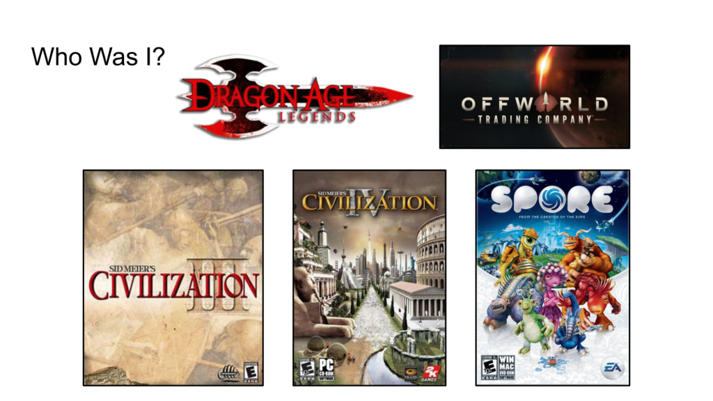
Here are the games that I’ve worked on. Spoiler alert: Civilization 3 and 4 are going to come up a lot in the presentation…

I also do a podcast where I interview game designers about why they make games, so check it out if you have time for 4-hour interviews.
Old World is a 4X set in classical antiquity, with a focus on characters. The simplest pitch is imagine a game like Civ but you are actually Alexander the Great, each turn you get a year older, and you will eventually die, and one of your children will take over.
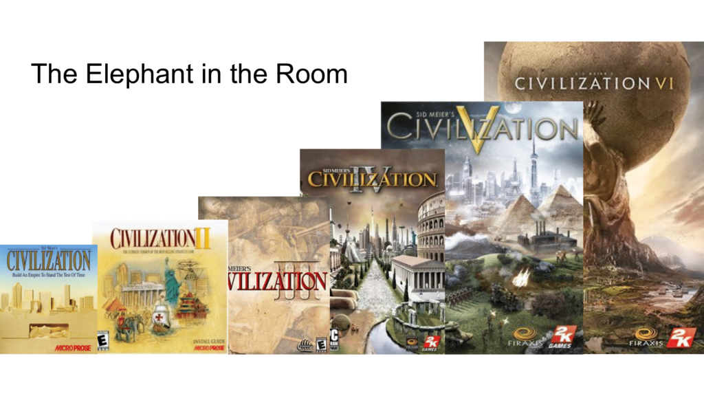
I’ve already mentioned the world Civilization a number of times, so let’s just talk about the elephant in the room. There is not a single preview or review of Old World that does not mention Civ somewhere in the opening paragraph. Every Twitch stream, you’ll always see a “is this the new Civ?” somewhere in the comments.

More personally, here is my own elephant in the room, Civ3 and Civ4. So, why should I go back to make a historical, tile-based 4X game? A Civ-like, so to speak.

Indeed, Civ4 was a best case scenario for a young game designer. It’s the #18 PC game of all-time on Metacritic – and the number one strategy game this century.
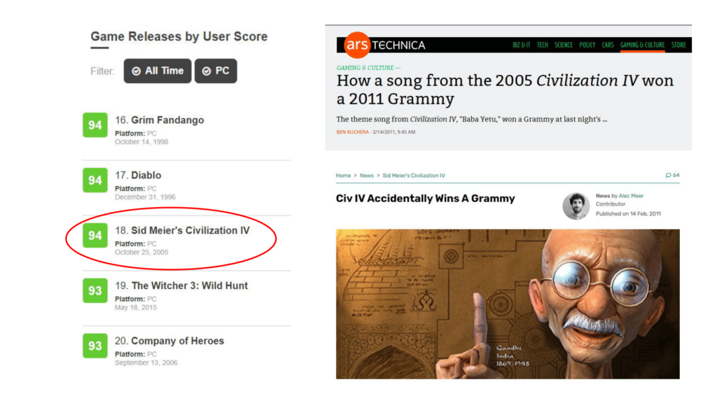
It somehow even won a Grammy award, for Baby Yetu, by my college roommate Christopher Tin, which was definitely not even on the radar when we developed the game. At any rate, Civ 4 was the first game I was the lead designer of. Frankly, it’s all downhill from here.
(Editor’s Note: Later in 2022, Old World actually was nominated for a Grammy!)
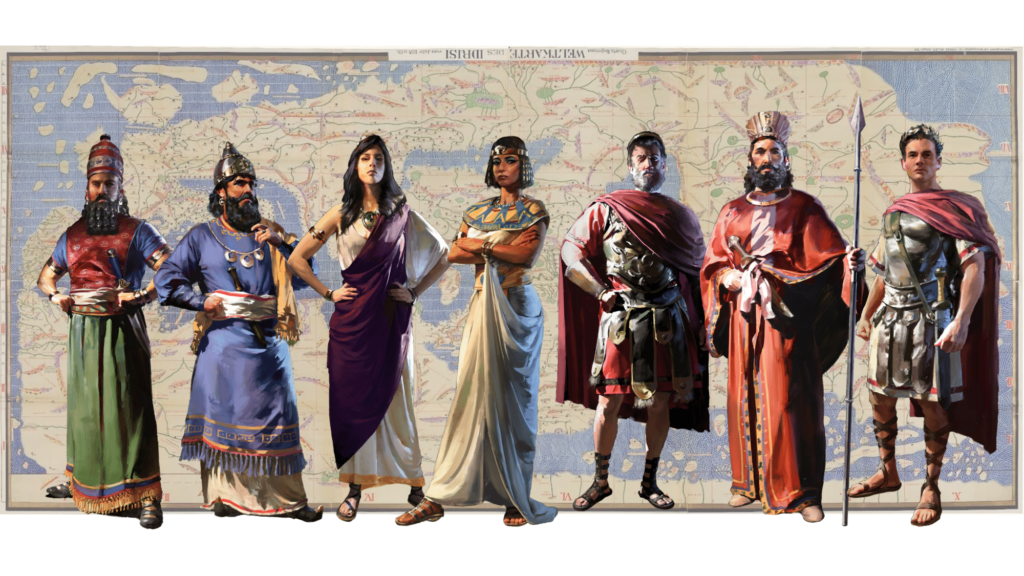
So, before I explain why I made Old World, let’s talk a little about what the game is and how it was developed.

Here is the very first pitch screen for Old World. It was a lot simpler at the start – in this image, it was conceived of as a tablet game, with the orders system and a resource market but without characters.
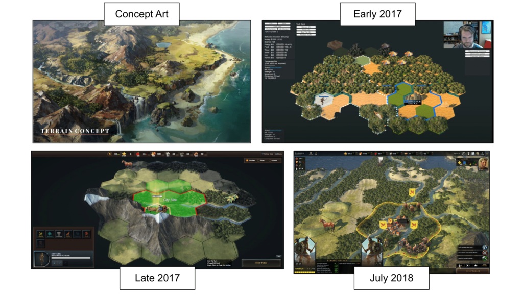
Here are some screen’s from the game’s prototyping phase. The earliest playable version, in the upper-right, was multiplayer only, just as I had done with Civ 4, and you can see that by 2018, we had started to add characters to the game.
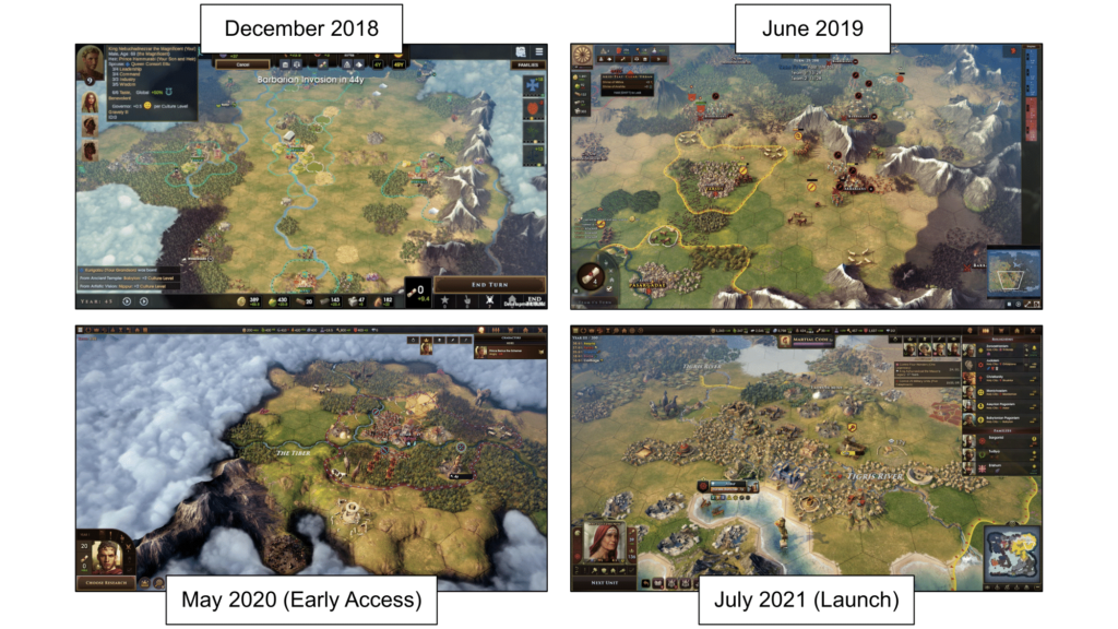
Here are shots leading up to release. There’s a lot to digest here, but I just wanted to give a sense of how the look and feel of the game changed, year-by-year.
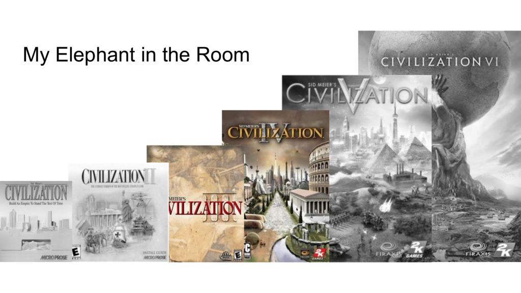
So, now let’s talk about why I made Old World. Why go back to revisit games that stand well on their own and, moreover, are part of a franchise that is continuing to succeed and grow.
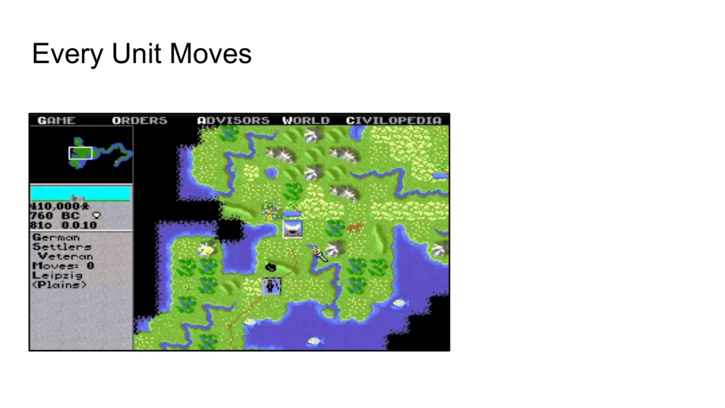
One good reason is to know your inheritance, to reexamine it, to look for ideas which were baked into the very earliest version of the game and see if changing them could transform the experience. A good example is what I’ll call “Every Unit Moves” which is how Civ has always worked. Every unit gets to move once per turn.
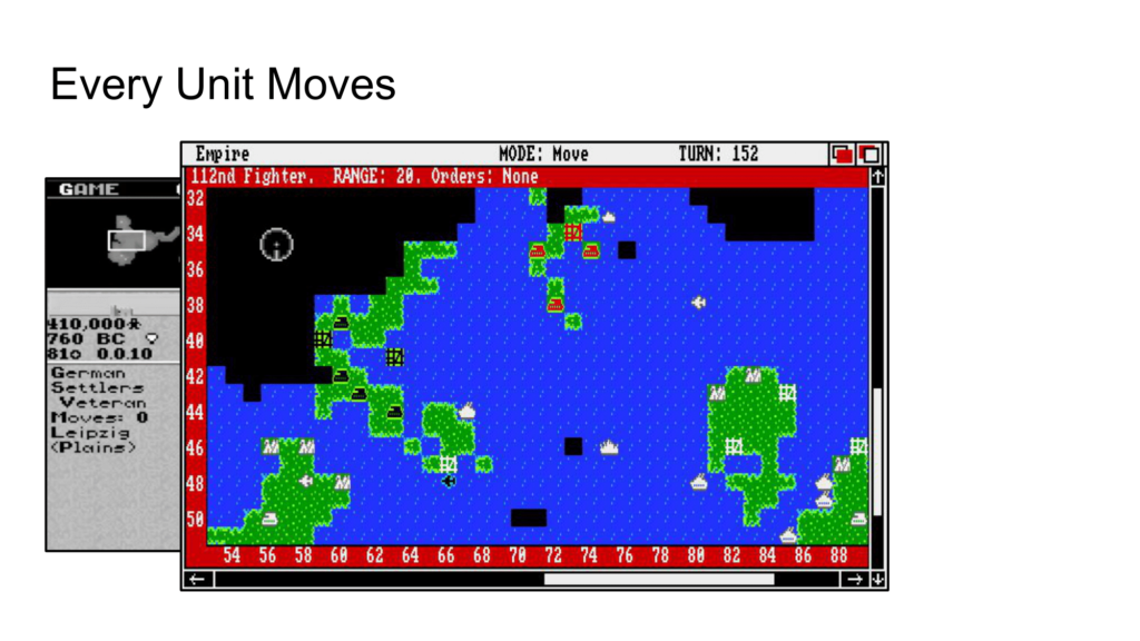
Civ inherited this mechanic directly from Empire, a game from the 80s which had much of the same tile-based, turn-based combat as Civ but without the scope of all human history.
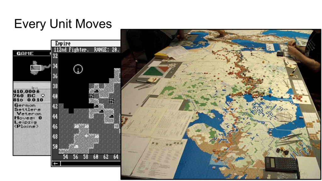
And Empire got Every Unit Moves from wargames, which you can see here in the form of a monster version of the Eastern front. The conventional way to play a hex-based wargame was for every counter to move once every turn.

The problem with Every Unit Moves is that you are not actually making any tradeoffs, not deciding between your military and your infrastructure. It’s Guns AND Butter. There is no reason NOT to take an action. This is one of the main sources of the late-game slog in Civ games – if you’ve built 100 units, then that means you have 100 decisions to make each turn, and frequent decisions are rarely interesting ones. Indeed, worker automation has become a standard, expected feature in latter Civ games because players know that these constant, low-stake decisions become boring quickly. Because creating more mines and farms has no cost to the player, there is no reason NOT to do so. Of course, players don’t want to have to do the busywork themselves – and it’s busywork because these decisions have no cost, no tradeoffs. Generally speaking, anytime you have to add automation to a game, it’s a red flag, a good time to evaluate whether the thing you are automating is well designed.
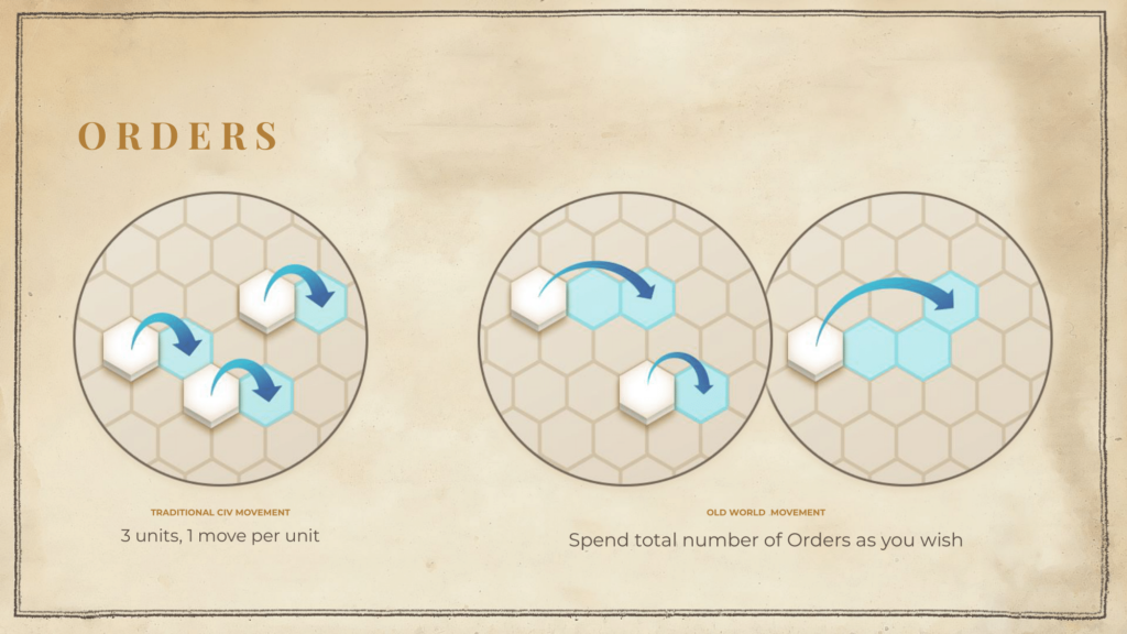
This is a slide from our original pitch deck explaining how Orders would work. On the left you can see Every Unit Moves and on the right you can see how it works with Old World. It’s up to the player to decide how to spend their Orders.
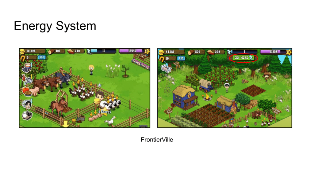
Orders didn’t come out of the blue. Instead, it came from a number of sources, including some odd ones like Facebook games. Here is Frontierville, by Brian Reynolds, the designer of Civ2, which took Farmville and added an Energy mechanic that limited the player’s actions.
This was an odd little moment in time, by the way. Three former Civ designers, myself, Bruce Shelley, and Brian, were all working for Zynga, and even Sid was making Civ for Facebook.
Note that the point of the Energy system in Frontierville was to ration out progress (so you don’t burn out on the game) which creates friction and, thus, a potential microtransaction. I didn’t have any interest in that – indeed, I’d say I had anti-interest in it – but I did like how it made you think about what to do with your actions. Suddenly, interesting decisions emerged!
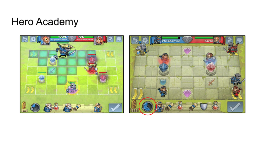
Here’s another example from that time period – Hero Academy from Robot Entertainment. This game gave the player five actions each turn which could be used for moves or attacks however the player wanted. In fact, this game went even further than Old World as units could attack multiple times per turn.
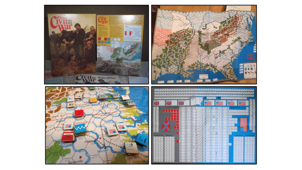
Not all wargames used Every Unit Moves. Eric Lee Smith’s Civil War game used an initiative mechanic where you alternated moves with the other side, which could allow you to move one army many, many hexes in one season while other troops were left in place. Coincidentally, this was the first wargame I discovered as a child, so I do feel like its ruleset has always been in the back of my mind.
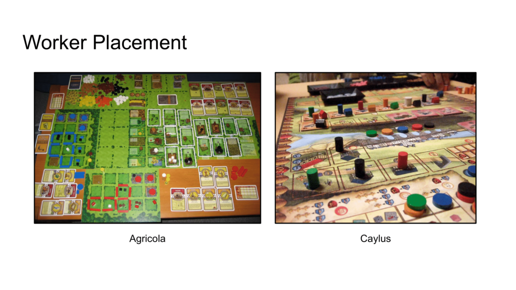
Worker placement games are also an influence as they are all about giving the player a lot of options but a limited number of actions. Choosing to do X means you can’t do Y.
The thing all these systems have in common is forcing the player to choose one thing and NOT to choose another. In other words, Guns or Butter.
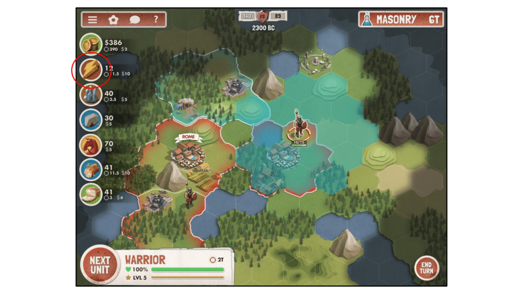
The Orders system was always part of the design, and it gave me a reason to return to making a Civ-like game as this one simple change would radically transform the game. There were many other new things I wanted to try, but this one change was the reason to get started.
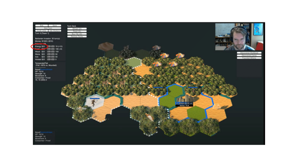
Of course, like all design, just because you have an idea, doesn’t mean you know how to implement it. There are probably 100 ways to make an Orders system work. I know because I tried 99 of them. Here, in the very earliest, multiplayer-only, version of the game, you could actually buy and sell orders freely, just like the other resources. It was super interesting strategically but was perhaps TOO interesting as it warped the whole game towards who could buy the most orders.
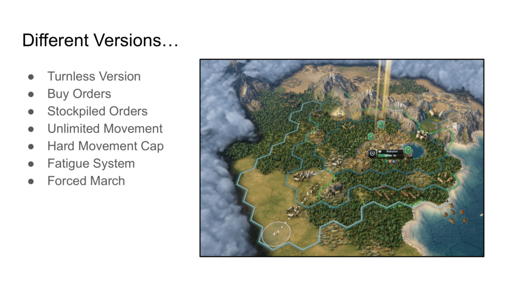
Here are some of the different versions of the orders system we tried – one on a real-time clock, one where you could stockpile unused orders between turns, one with a hard cap, and so on. We eventually settled on a fatigue system where most units could move three times a turn but could move farther via a Forced March which had a steep cost.
However, most of these other ideas didn’t get tossed away. Instead, we hid them away behind late-game laws – Coin Debasement unlocks buying Orders, for example, and Elites unlock Stockpiling Orders. That’s a useful trick if you ever try something which is interesting but just too powerful. Don’t cut it right away – instead, shuffle it away to the late game where it can stay interesting but rare.
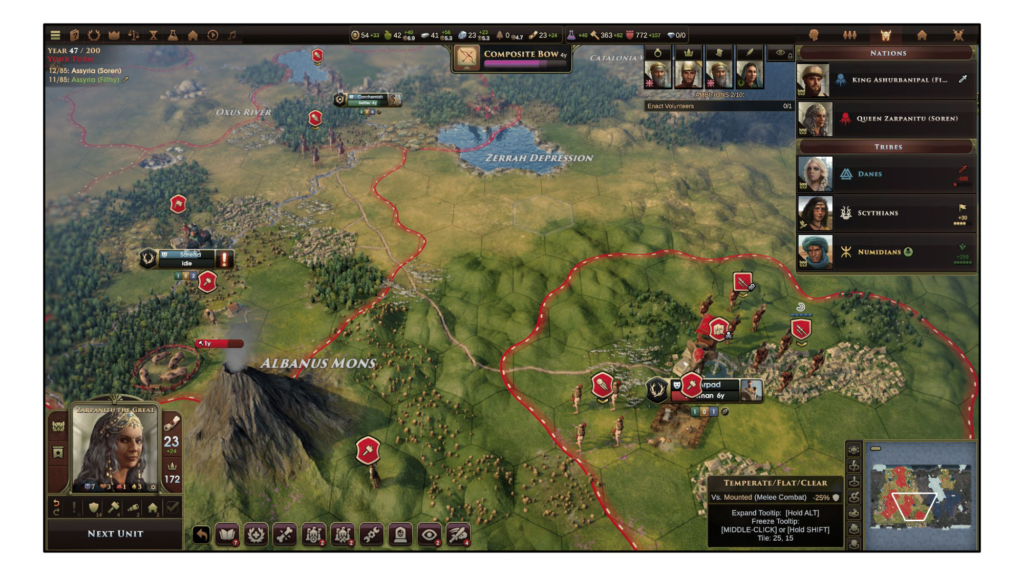
I was worried about the ramifications of Orders for the AI but, in the end, it worked out for the best because it enables the AI to actually attack on their own initiative, instead of coming at the player slowly, turn-by-turn, allowing itself to get picked off. Multiplayer sessions, on the other hand, were fascinating – victorious teams were usually the ones who saved Orders for their economy as roads became hugely important in order to make units more Orders efficient.
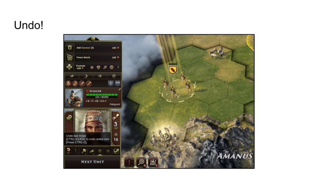
The strength of the Orders system was the huge possibility space it created each turn because there were so many different ways to spend your Orders. This vast, sometimes intimidating, space led to the Undo feature which kept players from feeling overwhelmed – players could try out multiple ways to launch an attack and then just change their mind and do something else.
It was initially intended just to help with misclicks but became a pillar of the game (and was awesome for debugging too).
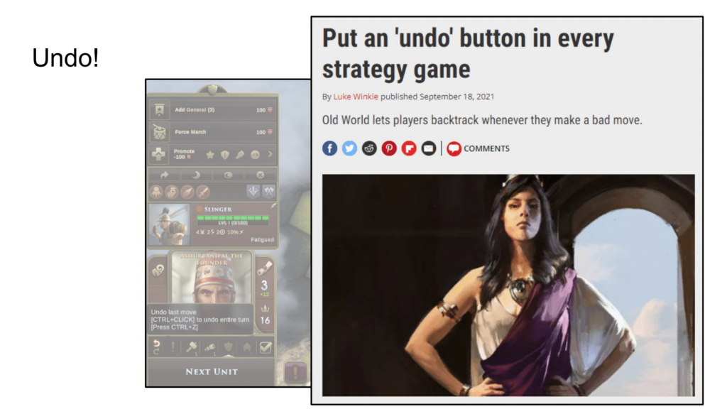
Indeed, undo turned out to be one of our most popular features – it was often one of the 3 or 4 bullet points listed in the pro column for reviews. It’s an unexplored area – a number of games like Invisible Inc and Into the Breach have experimented with limited undos but we didn’t find that necessary. Players appreciate being able to play the game however they want to play it. (It helps, of course, that we have deterministic combat. Games with a lot of output randomness would not be a good match for an undo button.)

While we are mentioning quality of life features like Undo, I also have to mention our help system as our tooltips have tooltips. As is often the case with strategy games, the tooltips refer to something that you need more information on, which usually means taking a trip to the manual or the wiki or the in-game encyclopedia. In Old World, you can either middle-click or shift-click to…
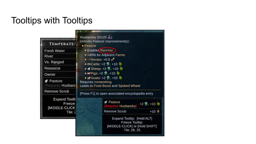
…just open up a new tooltip off of the previous one. Now, we might want to know what Rancher means, so we just…
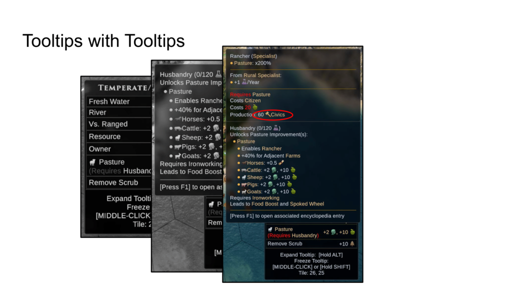
…open up another tooltip. Hmm, I wonder what Civics are…
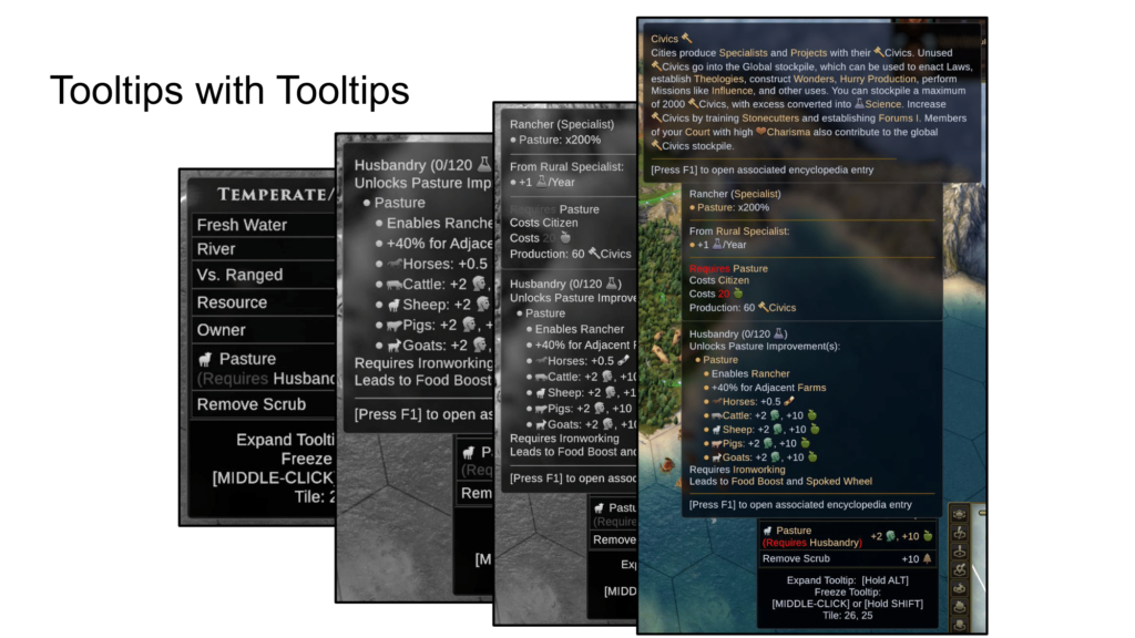
…and you can go as far as you want. We have Infinite tooltips!
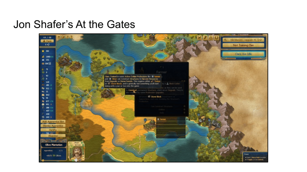
I definitely want to mention that the designer who pioneered infinite tooltips is Jon Shafer, who worked with me on Civ 4 and was the lead designer of Civ 5. Old World was the second game to implement them, and I expect them to become a standard convention for turn-based games in coming years.
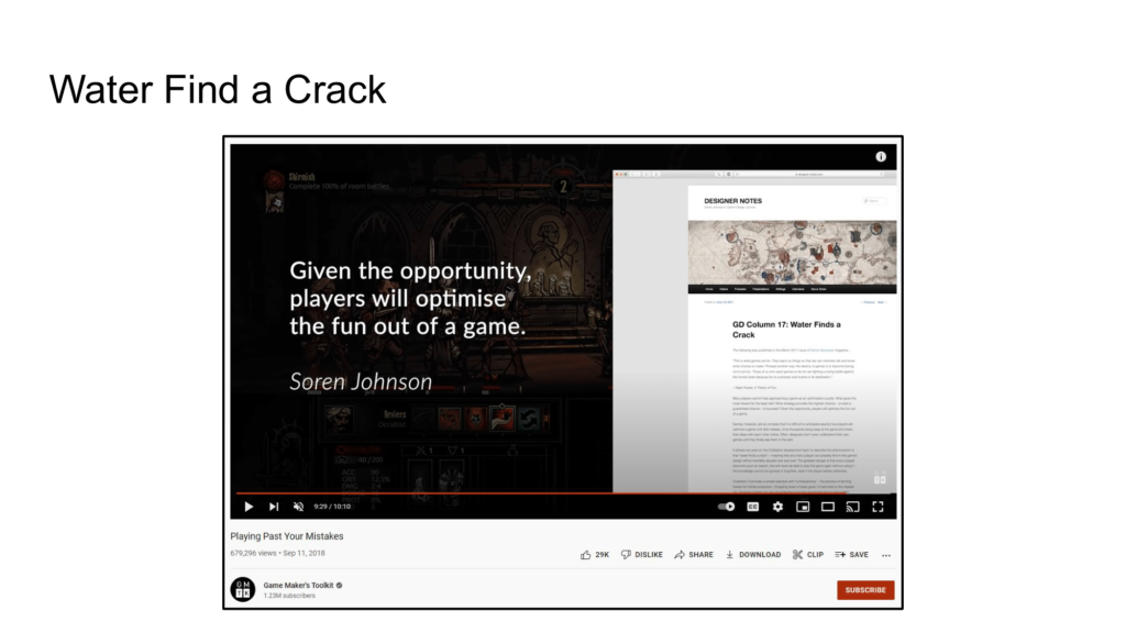
I wrote this line in a column entitled Water Finds a Crack back in 2011, and it is now permanently the most popular post on my blog. It’s sort of taken on a life of its own, showing up in random videos and other GDC talks, and it is also super applicable to ICS. What is ICS, you might ask?
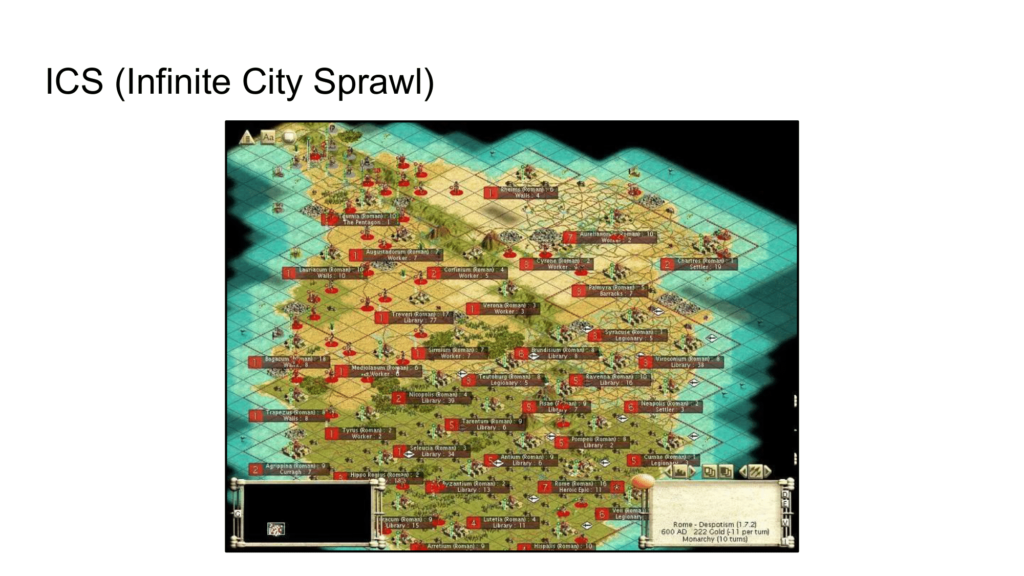
ICS means Infinite City Sprawl, the bane of Civ designers. Basically, players learned early on that the most optimal way to play was to squeeze as many cities onto the map as possible. Each iteration of the game tried a different method to fix the issue: Civ 3 had Corruption, Civ 4 had Maintenance, Civ 5 had Global Unhappiness, but they all are unfun bandaids.
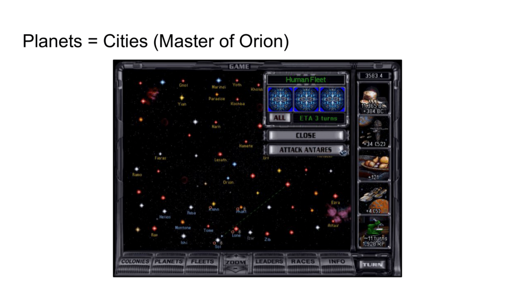
Interestingly, this is a solved problem for space 4X games – Master of Orion, traditionally considered the first space 4X, didn’t have this issue because “cities” are equivalent to planets, so one city per planet. Thus, a fixed number of cities each game.
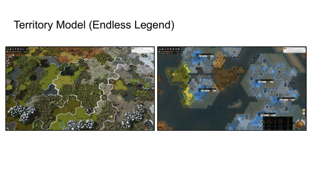
Endless Legend and Humankind do something similar with regions, cutting the board up into territories at the start of the game and then allowing only one city per territory. We tried something like this with Civ 3, but I was unsatisfied with it because I felt that your choices should determine the borders between cities, not the designer’s hand before the game begins.
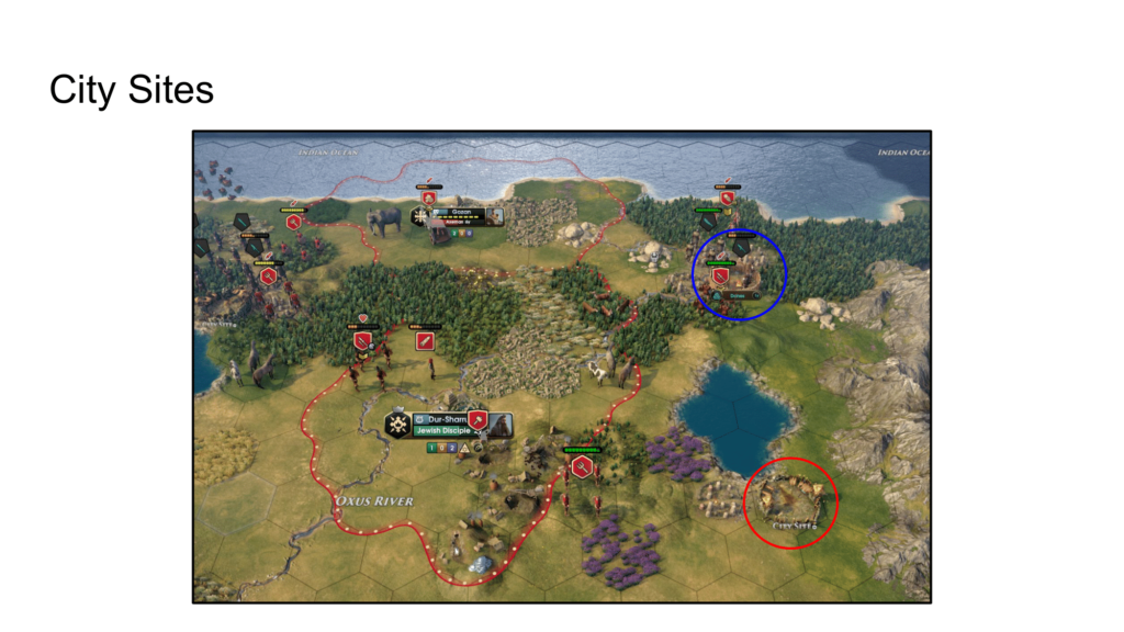
I found a middle ground between limited sites and dynamic growth by putting preset city sites on the map but then all the border growth after that would be determined by the player’s actions. New borders would come from tile specialists and urban improvement. Thus, we rejected one more piece of our inheritance as borders have always come, at least since Civ 3, from a city’s culture.
Finally, city sites also gave us a natural place for tribal camps, which helps drive conflict and ensures that the player needs to balance expansion with military and not just spam settlers.
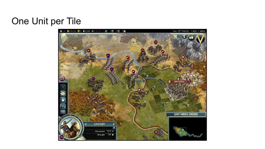
Civ 5 introduced one unit per tile, a big change for the series. Definitely another elephant in the room, although in this case not my elephant. At any rate, the popularity of Civ 5 and 6 meant that a lot of players would expect one unit per tile.
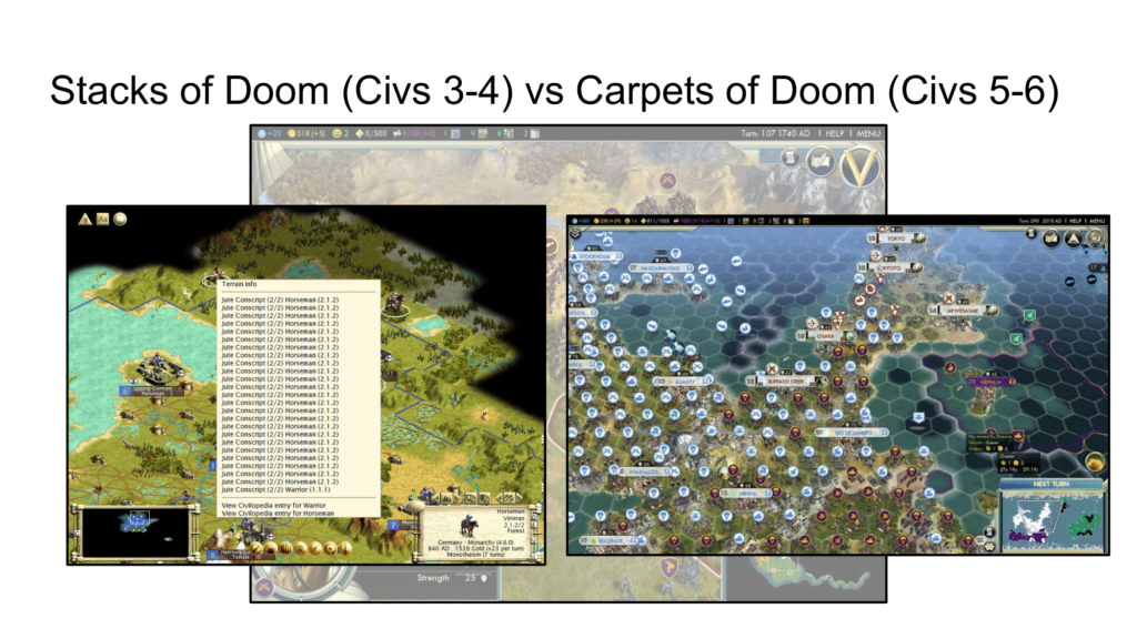
Debates rage over Civ4’s stacks-of-doom vs Civ5’s carpets-of-doom. However, making a big change to combat was needed for Civ 5 as each iteration needs to shake things up. Just as Old World needs to justify its existence, each version of Civ does too.
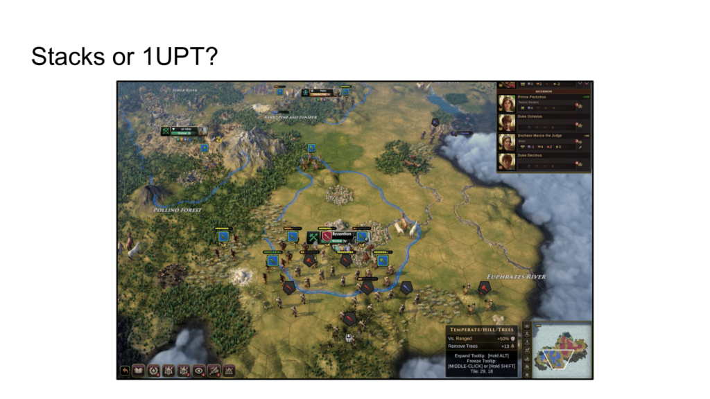
We started with one unit per tile simply because it was the easiest thing to code, but I thought I had a clever solution for a better stacking system – simply put, the player could stack units, but if that tile was ever attacked, each unit on that tile would be hit equally. Therefor, because Old World has no counter-attacks, stacking a bunch of units on the same tile would be very dangerous. So, we were naturally encouraging players not to stack their units, but they could be tempted to if stacking an extra unit on a tile got them a kill.
However, before finalizing anything, we decided to try classic one unit per tile combat just to see how it felt, and surprisingly, it felt great. It works because Old World doesn’t have counter-attacks like all of the other Civ games. Combat is essentially split across multiple turns, with units trading blows until one dies or retreat. Each separate attack is without risk – only the target is damaged. The Orders system made this necessary because allowing defenders to damage attackers is akin to giving them a free Order-less attack, and defenders almost always have an advantage in these types of games anyway.

Ultimately, however, I wanted to reward attacking because attacking is more fun. Pictured here is a very rare version of Risk – only 1000 copies were ever made. It’s the one Rob Daviau worked on before designing Risk Legacy, and it made one huge, crucial change to the game.
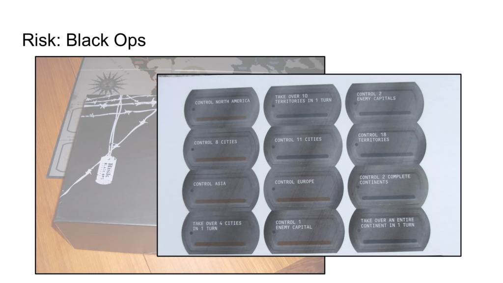
It added objectives, which are crucially important because you win the game not by conquering the world but by simply being the first player to achieve 3 objectives. They were so important to achieve that they changed how people would play the game. Instead of playing defensively and turtling up in Australia, players would want to go on offensives each turn to grab these objectives, which go to the first player to achieve them. You would overextend yourself to try to actually control Asia just because you wanted that objective even though you knew you would lose Asia the next turn. It made for a more dynamic game because attacking is fun.
Generally speaking, taking actions in games is more fun than making it harder for other players to take actions. Conservative counterplay is less fun for you, and it’s definitely less fun for your opponent.

Civ players are used to beating the AI by allowing it to kill itself against your heavily fortified units, so taking away counter-damage is a big change, but again, I wanted to reward attacking because attacking is more fun.
However, allowing players to overload a combat front via stacking to get a kill took away the opportunity for the defender to counterattack, so one unit per tile was actually a very important piece of the puzzle to making our combat system work.
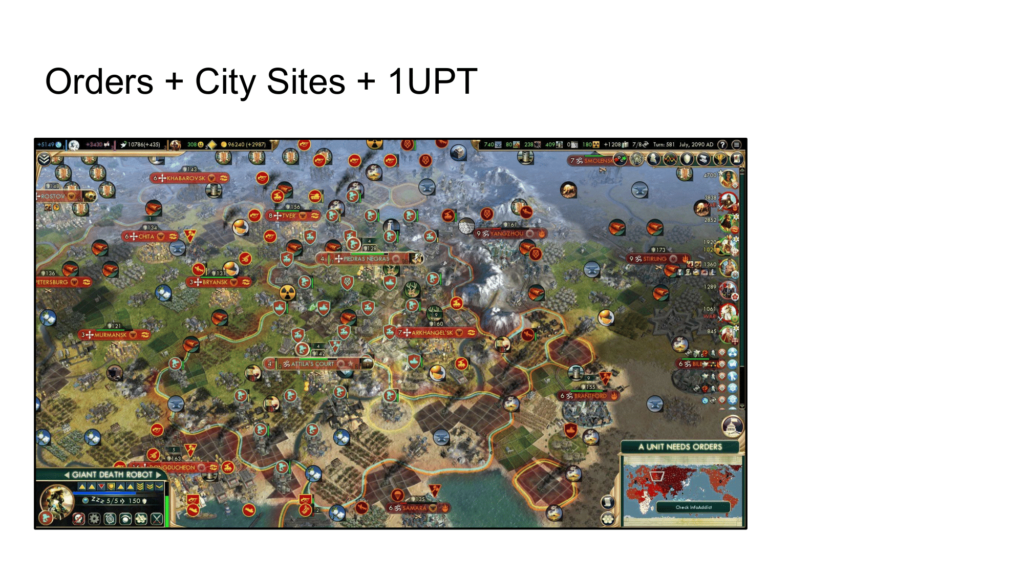
Really, you have to look at it holistically, as the three systems support each other. The biggest problem with one unit per tile in Civ is that it leads to traffic jams where units clog up the tiles between cities.
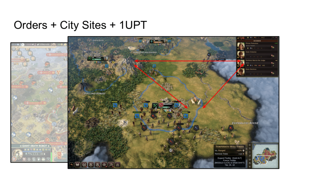
City Sites alleviate this problem because we can enforce a very high minimum distance between cities, much higher than in a Civ game. The Orders system, on the other hand, ensures that units don’t block each other while moving through tight passages because every unit can make multiple moves per turn if necessary. And, as I mentioned, one unit per tile balances some of the extremities of the Orders system by making it impossible to form stacks to kill a unit in a single turn, which removes the ability to counter-attack. So, the three systems fit together nicely, buttressing one another.

Pingback: My Elephant in the Room, Part 2 | DESIGNER NOTES
Pingback: My Elephant in the Room, Part 3 | DESIGNER NOTES